Ever wonder what your house looked like 75 years ago? Or if that beach from your childhood photo album still looks the same? … Read More >>
Category Archives: The Generalist
TEDx Boston 2011 x IDEO: Design Thinking for the Real World
For my second TEDx Boston 2011 Adventure, I attended a day-long workshop at IDEO in Cambridge, MA. The theme for the day was, … Read More >>
Internet Week 2011: Sketchnotes for Nicholas Kristof Keynote
Click for full-sized Image! Last week we kicked-off our new Sketchnotes channel (www.core77.com/sketchnotes) with “Sketchnotes … Read More >>
New Museum & Friends to Take Over the Bowery for the “Festival of Ideas for the New City”
The New Museum, the preeminent contemporary art institution in Lower Manhattan, recently announced the full details about the … Read More >>
Cook the Book: ‘Plenty’
Written by a chef, and a meat-eating one at that, Plenty includes some of the most thoughtful and innovative veggie dishes … Read More >>
New Finnish Design: SCENARIOS
A group of journalists gathered at the home of the Ambassador Ritva Jolkkonen of Finland yesterday for a preview of this … Read More >>
Google Announces New Service for Nonprofits
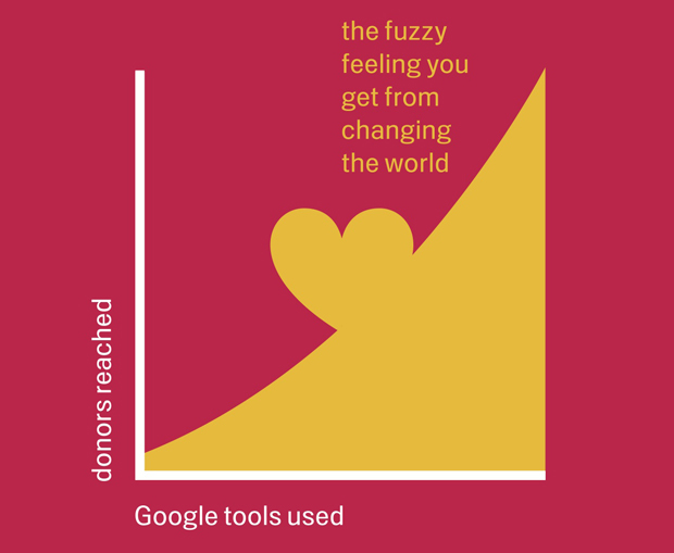
A new education and grant service from Google aims to help nonprofits.Google has announced a new program for nonprofits, which … Read More >>
Big Rethink 2011: Small is Beautiful
The Economist’s big conference the Big Rethink was certainly big on presentations (a series of them from 9am to 5pm from the … Read More >>
Angry Birds Game Coming to Facebook
Rovio CEO Mikael Hed says the immensely popular Angry Birds game is coming to Facebook next month with “completely new … Read More >>
Building Mobile Momentum
Designing For Use
If the only tool you have is a hammer, you tend to see every problem as a nail.
Abraham Maslow, American Psychiatrist (1908-1970)
Designing effective user interfaces (whether for desktop, mobile, or other devices) requires a combination of adaptability and creativity.
At The1stMovement, we believe there is a sweet spot on any initiative between what is useful, usable, and desirable; finding it requires aligning business goals with user behaviors, and in the process understanding the strengths and weaknesses of each platform.
Although it’s tempting to try and find a single solution for all devices, it’s in most cases it won’t be realistic in the near future. But, the reason for the differentiation of experience has as much to do with user needs and behaviors as with technological limitations and variations.
Generally speaking, there are two approaches to creating an interactive mobile experience; the mobile web and native applications.
Native applications for mobile platforms allow a level of user engagement that meets and in many ways surpasses the experience of the desktop web and applications, but require significant levels of commitment both from developers and users. A native mobile application is not always the right approach.
It’s also tempting to merge desktop and mobile websites through a “one-size fits all” approach, the modes of use of mobile and desktop systems are vastly different, and make this very difficult.
On desktop browsers, the user often feels rewarded for taking a more leisurely approach. The amount of screen real estate in the web browser allow for the presentation of information in a broader manner, with additional content and links presented on the screen.
On mobile phones, users have more focused objectives when compared to desktop browsers, and the issues of designing for these objectives is magnified by the limitations of mobile devices (both in terms of the screen size and the interaction through touch screen or micro-keyboard).
Effective mobile website interfaces are extremely streamlined and require a minimum of navigation and clearly delineated action states. Although it doesn’t directly correlate to the mobile web, the iPhone interface system is a great example of optimized use of the limited screen size and touch screen navigation; the user is provided with a limited set of options that tend to be organized in a more hierarchical manner.
At the end of the day, sites built for mobile devices should be used to serve their audience, should be designed for how they are used, and should not be shoehorned into providing functionality counter to what makes sense for the user.
Though it is tempting to believe that it is possible to create a single solution to address all browsers, it is usually more effective to create separate browsing experiences for mobile and desktop users.


