Rovio CEO Mikael Hed says the immensely popular Angry Birds game is coming to Facebook next month with “completely new … Read More >>
Building Mobile Momentum
Designing For Use
If the only tool you have is a hammer, you tend to see every problem as a nail.
Abraham Maslow, American Psychiatrist (1908-1970)
Designing effective user interfaces (whether for desktop, mobile, or other devices) requires a combination of adaptability and creativity.
At The1stMovement, we believe there is a sweet spot on any initiative between what is useful, usable, and desirable; finding it requires aligning business goals with user behaviors, and in the process understanding the strengths and weaknesses of each platform.
Although it’s tempting to try and find a single solution for all devices, it’s in most cases it won’t be realistic in the near future. But, the reason for the differentiation of experience has as much to do with user needs and behaviors as with technological limitations and variations.
Generally speaking, there are two approaches to creating an interactive mobile experience; the mobile web and native applications.
Native applications for mobile platforms allow a level of user engagement that meets and in many ways surpasses the experience of the desktop web and applications, but require significant levels of commitment both from developers and users. A native mobile application is not always the right approach.
It’s also tempting to merge desktop and mobile websites through a “one-size fits all” approach, the modes of use of mobile and desktop systems are vastly different, and make this very difficult.
On desktop browsers, the user often feels rewarded for taking a more leisurely approach. The amount of screen real estate in the web browser allow for the presentation of information in a broader manner, with additional content and links presented on the screen.
On mobile phones, users have more focused objectives when compared to desktop browsers, and the issues of designing for these objectives is magnified by the limitations of mobile devices (both in terms of the screen size and the interaction through touch screen or micro-keyboard).
Effective mobile website interfaces are extremely streamlined and require a minimum of navigation and clearly delineated action states. Although it doesn’t directly correlate to the mobile web, the iPhone interface system is a great example of optimized use of the limited screen size and touch screen navigation; the user is provided with a limited set of options that tend to be organized in a more hierarchical manner.
At the end of the day, sites built for mobile devices should be used to serve their audience, should be designed for how they are used, and should not be shoehorned into providing functionality counter to what makes sense for the user.
Though it is tempting to believe that it is possible to create a single solution to address all browsers, it is usually more effective to create separate browsing experiences for mobile and desktop users.
Congrats to Steve Portigal, Nathan Shedroff Chris Noessel, New Rosenfeld Media Authors
User experience book publisher Rosenfeld Media has announced two new books-in-development that ought to be interesting to … Read More >>
Tumblr Introduces Curation Feature That Encourages Users To Tag Posts
Who here with a Tumblr blog tags their posts? Hands? Well, you might want to start sweetening up your SEO, as Tumblr has … Read More >>
Playable Angry Birds Cake Is Deliciously Amazing [VIDEO]
The megapopular multi-platform game Angry Birds has inspired all sorts of weird and amazing creations, but the playable … Read More >>
Despite 861.5 Percent Growth, Android Market Revenues Remain Puny
You read the headline “Android Market grows a staggering 861.5 per cent”, and you think, “Wow, Android is really on a tear.” … Read More >>
Image Space Object 6
While doing some research on storytelling yesterday, I came across this quote from Shakespeare’s Henry IV, Part 2:
“When we mean to build, we first survey the plot, then draw the model.”
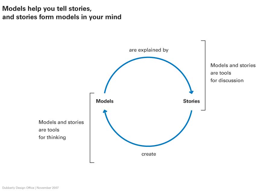
Odd, I said to myself. That’s exactly what we do at Image, Space, Object; use narratives and models to inform the design process for small teams working on highly collaborative and iterative projects. And that, in turn, reminded me of an image that Hugh Dubberly sent to me after the last ISO Conference that highlights the relationship between stories and models:

Okay, maybe Shakespeare was speaking about physically surveying the plot (more in space than time), but the idea is very similar. Look at the situation. Model it. Reassess. Replot. Remodel. Present.
August 5-8, 2010 at Rocky Mountain College of Art and Design (RMCAD) will mark the 6th Image Space Object conference. I have been lucky to serve as a speaker and studio mentor for all six, and believe that, even with all the conferences and workshops I’ve attended, it is the most engaging and unusual.
There are some fabulous speakers at the conference (and it tends to be very much the same crew each year). This year, in addition to the organizers Mike and Kathy McCoy and Fred Murrell, studio mentors include Hugh Dubberly of the Dubberly Design Office (who has been at ISO each year, I believe), Rick Robinson (Founder of eLab and formerly at Sapient), Chris Conley (from IIT and Gravity Tank), and Tucker Viemeister (director of the Lab at Rockwell Group). New this year at ISO is Shelley Evenson of Carnegie Mellon, and I’m very much looking forward to meeting her.
But, what makes ISO different from other conferences is that the participants, errr, participate. As Mike McCoy is fond of saying, this is more of a graduate seminar than a series of lectures. Each attendee works together with their team and their studio mentors to build an original solution to a vexing (but entertaining) design problem. The challenge forces the team to work together in a multidisciplinary way to devise and present their solution.
We’re calling this year’s conference “Tools for Transformation”, and that’s exactly what it offers those who take part. Tools for collaboration, ideation, and expression, with a focus on rapid, low-fidelity, down and dirty prototypes. The entire conference is limited to just 40 participants, so it is truly a unique opportunity to get in and get your hands dirty.
Here is how Rick Griffith of Matter described his experience at last years conference:
Find our more at imagespaceobject.com.
Story-Centered Design
Overview
The title of this article is Story-Centered Design, but what it really concerns is taking an integrated, holistic approach to developing solutions, especially in collaborative problem solving. It is a truism to say we’re working in an increasingly collaborative age, and it may be overstating the case somewhat (people have always worked collaboratively). What is true is that the partners in our collaboration have expanded to include not only designers and sponsoring organizations but also various audiences and potential audiences, and many of our tools are increasingly complex; by focusing on the human aspects of our work, we improve the value of what we create.
Design is a process of problem solving; addressing complex design issues requires the ability to understand the problem in as comprehensive a manner as possible in order to create the best possible solution. A story-centered approach, in conjunction with other user-centered design techniques (including research and prototyping), can help to create superior outcomes by encouraging a whole systems approach to understanding.
 Stories are how people communicate; this is as true in design and business as in our personal lives. From developing the initial vision for a project through implementing the solution, any complex project requires consideration of numerous points of view. Ultimately, the best solution is the one that most elegantly and simply addresses the needs and desires of the various audiences, and narrative approaches provide an effective tool in helping to define, share, and develop that solution.
Continue reading
Feed The Kids
Yesterday I posted this video on the buckfifty.org website – to my mind it’s a document of a time in Denver, the early 1990s, when the downtown area was still pretty deserted. My buddy Ray and I used to do performance art around town under the moniker of Two Significant Guys; our general mantra was that “you are only as successful as you pretend to be.” This was the era of Bush the first, so it seemed appropriate. It’s interesting that we spoke so much about change – I guess we were before our time.
So, in this video the Two Significant Guys encourage the feeding of kids while speaking of the importance of family values. We also eat mexican food and report on the implosion of buildings, including the Truckers Terminal and Montgomery Wards. Recorded in Denver in 1991 and 1992 with Hugh Graham and Ray Schelgunov under the direction and camera of Mike Reddick.
rejection letters, 1933-1937

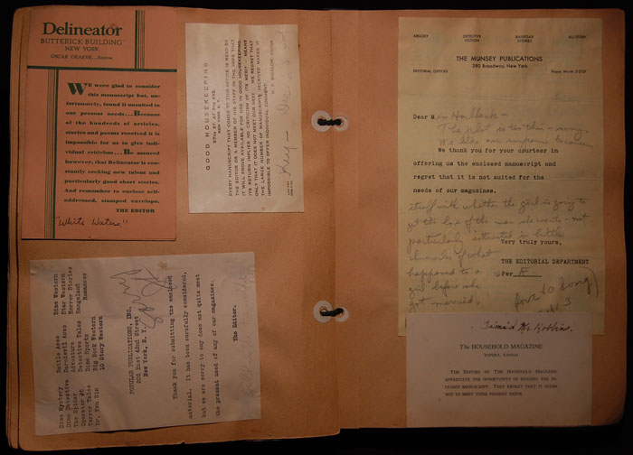
I added a new post to buckfifty.org today that’s pretty fascinating. It includes a slideshow of rejection letters from a scrapbook that jhh and I found in our basement back when we lived at 29th and Wyandot here in Highland.
The author of the scrapbook was Mary E. Horlbeck, a writer who lived in Edgewater during the 1930s. Between 1933 and 1937 she created this book of 138 rejection letters she received from magazines and newspapers for short stories she had written. She did eventually publish some stories, but not until after this scrapbook was full. It’s a remarkable expression of the dedication of a writer to getting published during the great depression.
Scrapbooks provide a fascinating glimpse into the past; in fact, Jessica Helfand has published a book on the topic (Scrapbooks, published by Yale University Press). Although this scrapbook doesn’t have the design sensibility of some of those that Helfand includes in her book (Anne Sexton’s scrapbook, for instance) Mary Horlbeck’s scrapbook is still charming and insightful.


